
David Baldacci

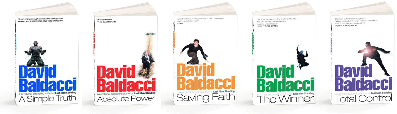
The David Baldacci make-over was based on a very dramatic use of white space working off the bottom of the page. And, sorry to bang on about it, attention the spines as display areas. Glen was great in giving me space to work and championing the look through the publisher’s processes, a real ally to the project. It is worth pointing out that within a strong publishing genre, such as mainstream thrillers, you can stretch things to a certain extent but must not lose the instant recognition factor for your audience. I’d love to try it but publishers do not warm to thriller jackets/covers that reference literary fiction or cookbooks! Publishers, I dare you to let me try!
We tackled the photo-shoot in one – very long – day. As so often, my first choice behind the lens was Colin Thomas. Colin is a tall thin, sometimes bearded, odd sock wearing fellow who has quite the easiest manner you could wish to work with. His skill and adaptability are superb. We have worked on hundreds of assignments together, from Ed McBain and Dick Francis to wild PhotoShop forays where Colin is a master. He does great location, advertising and portraits and catalogue work. Damn, he’s talented. You would love working with him. Check the Digital Imaging on his website. It’s insane.
By the way, the model on A Simple Truth was a cracking fellow who appeared as an actor in a Guy Ritchie film. I think due credit is so important and I am maddened I cannot remember or find his name to check him. Maybe you can help, film buffs?
Anyway, returning to the ‘internationally-acclaimed best selling thriller’ schtick and the commercial imperative, the David Baldacci make-over exceeded the publishers’ expectations winning prime display and shelf space everywhere. His industry currency soared and the auction value of his next book went stratospheric.
What I would like to know is what thriller covers have appealed to you? Why not leave a comment and tell us why you like them?
And I’d love to hear what you think of Colin Thomas portfolio . . .

Interesting to hear the story behind the designs – the connections & side stories. More to being a creative than the obvious. Colin’s digital stuff is great.
That’s true. Every job is different really. Different experiences. Things to learn. A lot of photographers use digital image manipulation but Colin takes to to another level.
Great post – really fascinating to understand the depth of thought behind your work and how, even though you are working to very tight parameters, you are able to solve communication problems with powerfully economical design.One of your covers has had a big impact on my life – Dick Francis Proof. I saw that cover when I was a kid. The simplicity and cleanliness of it really appealed to me. I didn’t know the hows or whys at the time, but it was one of the pieces of design I remember that has pushed me down the path I now follow. What a small world.
Thank you, Sam. Great to hear I managed to inspire you in a small way back then! Colin Thomas photography, even then.