
Hibrow – the Arts online
Last summer Joanne Jacobs, introduced me to a new project called Hibrow that was yet to find the right designer.
It immediately made me sit up and listen as, 1. Joanne is a highly focussed individual and, 2. The project was creatively led and the brainchild of Don Boyd, Film Director & Producer. At a great meeting I found a man fizzing with infectious enthusiasm and very determined to realise his dream of bringing HD video of the Arts online. His insistence on quality and high production values was inspiring. I probably talked too much and doubtless made some inappropriate quips but common cause was quickly established.
I’ll post about the wider project soon but, for now, I just wanted to say a word or two about the logo. After a huge effort from many talented people Hibrow just launched at The Crypt, St Martins-in-the-Fields, London and I determined to tap on the straining keyboard before the week was out. The party contained much grooviness and was richly sprinkled by luminaries including John Hurt, Gary Kemp, Floella Benjamin and, nah, I’ll stop there. After all this isn’t Hello! magazine.

orry, back to the logo, dear design groupies. Well, I had a free brief, the passionate zeal of The Don, the force of nature that is Jo Jacobs, the shrewd young eye of Dominic Dowbekin – and the planet-wide lovers of Art, Music, Theatre, Dance, Literature and Cinema as the target audience. What pressure?
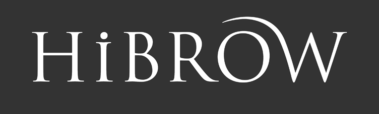
An initial introductory meeting helped me take the temperature of the venture. Soon I had the pulse of the beast. A classy wide-ranging labour of love and endevour. Click the ‘Like’ button. But I gave a lot of thought to the name itself to tease out the nuances. On the positive side it implies educated, up-market, sophisticated, informed and cultured – which Hibrow certainly is. But I saw a danger of jibes from naysayers at an implication of pretention or being a teenie-tiny bit up itself – which it certainly isn’t! So my design takes a classical stance but with just a little humour. A dig in its own ribs, as it were. Ribs I look forward to mildly tickling as Hibrow grows. Such as the video lead-in which Chris Ennis skillfully helped me make move as intended! Please ‘click’ the link below – one day I will learn how to post a video clip in WordPress.
hibrow_front_bumper_withpip_h264_web_master_stereo
hibrow_front_bumper_withpip_h264_web_master_stereo
More on the website soon. For now please have a good old explore on the site . . . http://www.hibrow.tv
For now, just the logo.
Do you like it?

I love it. I think it’s the perfect logo for what it is!The only thing I’d change on the video is that I’d make the O smile (i.e. upside down it) and perhaps something subtle with the dot of the i at the same time? But then again maybe leave the i and tickle it later?
Thanks Naomi. We like it as a ‘wink’ on the video lead-in! The logo is designed for further development of the elements, as you have spotted. But for now restraint is in order. After all we don’t want too much distraction from all those juicey HD Arts Videos do we!
I think it is a VERY clever logo! I’m not a design person, yet I wonder whether adding to it would make it seem too “busy”. In any case, excellent job, IMHO!
Thanks Gregory. I think we all respond to design one way or the other. Often unconciously. I agree about not adding to it though some elements can evolve in time. In the company of so many top Arts professionals I don’t want graphic designer’s muddy boots all over it! Less is more.
The HiBROW logo has the elegance of a stone cutters work, it avoids the all too common pitfalls of corporate branding, its increasing rare to see elegance and humour combined so effectively. Very tasteful.
I like it, adapting any letterform is alot more difficult than it looks and you’ve pulled it off, good work.
Wow Stephanie! Praise indeed from Cambridge University Press. Thank you for your kind and thoughtful comment.
Thanks Gareth. Great to have a piece valued by a fellow professional!
I think it’s gorgeous! Lots of class, sir!
Thanks Kate. HiBROW are a classy client!
Handsom logo! Well done as always, Gary!
Thank you Doug. Designed the site too _ should be of special interest to you and your musical & movie friends! Talk soon.