Salman Rushdie
A headline on the BBC website caught my eye:
“A secretly filmed adaptation of Salman Rushdie’s novel Midnight’s Children has finished shooting in Sri Lanka.”
But there was trouble again for the author.
It turned out that Director Deepa Mehta chose the island location over India or Pakistan, where the story is set, to avoid religious protests. Iran had objected to Sri Lanka’s Premier and filming came to an abrupt halt. You will recall Iran’s former leader Ayatollah Kohmeini was the source of the misguided (potty) Fatwa on Rushie for The Satanic Verses. I have never believed the author sought controversy or intended offence. He is an exceptional writer who sets his work in complex societies he knows well. He was a soft target for zealotry.
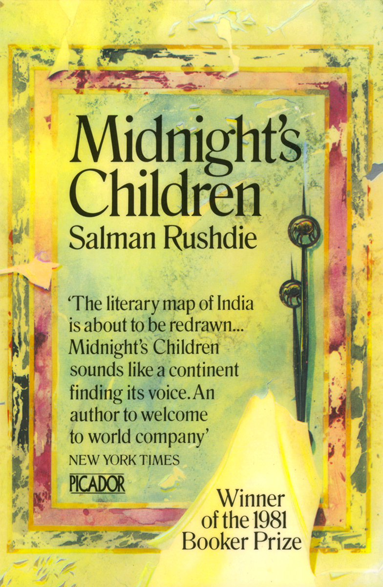
I leave this well-worn topic and return to more innocent times, at Stanley Studios, London SW10, as I set about designing the original paperback cover for Midnight’s Children. Not for the first time Pan’s commitment to the significance of the book was to be reflected in the point-size of the typeface. The trouble with a brief of ‘Big Author + Big Title’ is that it can be a typographical blunt instrument. But Sonny Mehta’s unerring literary judgement had picked another great.
In fact he saw it as a possible Booker Prize winner. So the task was to work with it and bring some character to bear. Devouring the tome hungrily in my West London flat I found there was a feast on offer. I was particularly struck by the doctor who when visiting a young woman is confronted by female family members protecting her modesty with a sheet. The sheet has a carefully placed hole through which only local examination of the immediate medical problem is possible. Over time the various local areas build an overall picture for the doctor who has gradually fallen in love with her. The film-maker’s must have had a such an amazing time with such rich narrative.
Potential bestsellers on the mass-market list at Pan Books (parent to the Picador imprint) endured relentless pressure, in cover briefs, to parade 70s film-poster style collages of heroes and helicopters exploding or some such chaos. It was clearly dated even then and I fought the good fight for better graphics where I could. On Picador we worked to develop ways to set the mood and entice interest with the visuals in subtler, but no less effective ways. Midnight’s Children was seen to have huge sales potential yet its target audience is inclined to more nuanced sensibilities. (Read between the lines people, work with me here) As some scribbled notes on the inside of the hardback edition reveal (just unearthed from a box emptied to fill yet another new bookshelf) the ‘just before midnight’ clock hands were my first idea but survived scrutiny. The execution would provide the character. I would handle the type differently now but remain happy with my apparently perverse choice of Ian Pollock to create for me the pealing paint/ faded opulence wall. He was widely celebrated for his brilliantly bizarre, idiosyncratic characters at that time. And we incorporated one big peel in case it won the Booker Prize. In that space I could announce its triumph and avoid a Daz-style corner flash. And if it didn’t, well it’s a peeling bit. The illustrator gave me the original painting (shown) and that recently emerged from another box.
I keep reading that blog posts should be kept short. Shame. Because coincidentaly that was the title of his next novel. I took the painted wall route again with the cover. This time with ‘Shame’ as graffiti, in Urdu I recall and Salman popped in to Stanley Studios to write it for me. Hard to imagine within a few years he would be in hiding.
Sonny Mehta left London for New York. I left Pan (well it was important for me!). Salman Rushdie went to Penguin with The Satanic Verses. Midnight’s Childen went on to win the ‘Booker of Bookers’ in 1993. Time sure keeps moving after midnight . . .
Can’t wait to see the film of Midnight’s Children. Or whatever else turns up in boxes come to think of it.


